Monday, 29 December 2014

River of Heaven

rpg.drivethrustuff.com/product/137589/River-of-Heaven

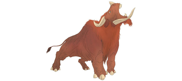
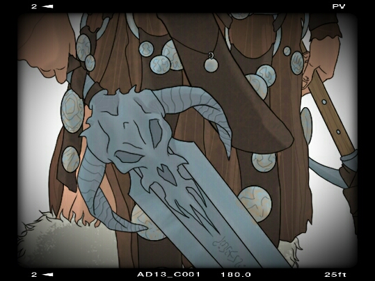
Well it is finally out so I can share with you some of the art which I did for the River of Heaven RPG from D101Games.
I did the whole of the book except the cover, which was done by the mighty John Hodgson before I came on board.

Great game: you should check it out.

(I didn't do this logo by the way, it's just on here as a header.)

Monday, 27 October 2014

Carpathia Gypsy Character

Here is an exclusive preview of one of the sample characters for the Carpathia! RPG.

I've been sitting on this for a while now as I'm currently hard at work on other projects but I wanted to share this with you to show that the project is still moving ahead and that I haven't dropped off the face of the earth.

While other paying projects have to take priority (some of which are awesome fun; I can't wait to share them with you!) Carpathia is very close to my dark heart at all times. Particularly at this time of year.

This was all done in Sketchbook on my phone, as usual.

Friday, 12 September 2014

devilmonkey Page 1

Here is my first pass at page one of 'devilmonkey', my creator-owned comic series (it's about a ninja monkey from hell who kills monsters- real cerebral stuff!)
It needs lettering yet, but I intend to do all of that at the end to maintain text continuity.

It's all drawn in Sketchbook on my phone and then composited together in Photoshop. The logo is a vector done in Inkscape.

Hope you like it.

Friday, 11 July 2014

Barbarians of Lemuria!

The new Mythic edition of Barbarians of Lemuria, the super cool, story - driven fantasy RPG from Beyond Belief Games and Filigree Forge is on its way!
I will be providing a lot of the work in this. I am so excited to be a part of this, having worked on lots of BoL spin-offs.

I love me some fantasy art. I'm so looking forward to getting my teeth into this!

Have a look at the Kickstarter: it's going to be a great success I'm certain, so it will be well worth getting in a pledge now to bag all of the stretch goals which it's gonna meet.

https://www.kickstarter.com/projects/700903193/barbarians-of-lemuria-mythic-edition

This is a picture of Krondar,  the Conan-a-like from the book. Great fun to draw ( I was watching Conan The Barbarian as I did him!). Great fun to play.

Sunday, 18 May 2014

Enter the devilmonkey

Teaser of the first page of my comic project.
More to come, with some 'making of' goodness.

Saturday, 3 May 2014

Justice League

www.liveforfilms.com/2014/04/30/vote-for-your-favourite-justice-league-poster/

The poster which I did a little while ago for the Live For Films website has now gone up for voting.

Here is the final image as well as a few process shots showing the linework and colouring stages.

The poster itself was done as an A2 vector in inkscape.
The image was drawn from photo reference for faces (other than Batman).
The drawing and colouring were all done in Sketchbook on my phone.
The final piece was composited together in PS.

Monday, 24 February 2014

Hannibal 1.2: Amuse-Bouche

Episodes as wine labels!
In this episode, someone grows mushrooms on deadish people. Awesome.
The quote is a nice one as it refers to the clippings Hannibal keeps in the books about church diasters.

Sleepy Hollow 1.5: 'John Doe'

Another minimal poster design for Sleepy Hollow.
I went for a woodcut-style representation of the Horseman of Pestilence. Then I duplicated it and shicted the colour to an acid yellow to sugest the CDC/ disease angle.
I like how the yellow plays off with the grey. And I lile the simple style of it.
I really enjoy this one. Bold stuff. Strong colours and lines.

Friday, 31 January 2014

This is my design

This is the stag drawing which I did to make up the Hannibal Wines logo for my wine label design. I drew this in Sketchbook Mobile on my phone and then imported it into Inkscape and created a vector from it, allowing me to resize it freely without loss of detail.
I want to share it here as you can't really see it too well on final design. But it is a crucial part of the design.

This is my design:

Thursday, 30 January 2014

Hannibal 1.1: Aperitif

Here for you to savour is my wine label design for episode one of season one of Bryan Fuller's masterpiece, 'Hannibal'.
Included in the design are a quote from the episode underneath the episode title ('Aperitif') and an image of Hannibal's cannibalistic feast for the episode: freshly fried lungs.
I do hope you enjoy...

Sleepy Hollow 1.4: 'The Lesser Key of Solomon'

Another minimal Episode Poster which I did for Sleepy Hollow.
Here we have the Star of Chaos or whatever they are calling it in this show (we all know what it is "Hail Tzeentch!") on the back of the Horseman's head. Obviously, when he had a head.
I tried to avoid going for tons and tons of black on this and ended up with the shading. Which I am not keen on, so I should have just trusted my instincts and gone for the old 'Paint it Black'.
Live and learn, though.

Also, annoyingly long title. Thanks for that, Fox.

Carpathia Headshots

I just realised that I haven't put these two up on here and I did them AGES ago!
Building up a library of NPC headshots, here we have the Innkeeper (does he kbow more than he's letting on?) and the Village Girl (is she a virgin sacrifice or something more sinister?).
Both of these ones are riffed-off original Hammer promo shots but then changed. I want to try and inject a sense of the original source materials into the game. Obviously I try to capture the 'Essence of Hammer' in all the pieces I do for this game but in trying to convey the cinematic aspect of the game, I like to cast actors in some of the roles. The Innkeeper is a special tribute to the actor who seemed to be in pretty much every Hammer movie. The Village Girl actually started life as Caroline Munro because, Caroline Munro.
Both done in Sketchbook Mobile on my phone.

Wednesday, 29 January 2014

Fate Toolkit: Anatomy of an illustration

 Here is a quick walk-through of one of my pictures from Evil Hat's 'Fate Toolkit'. Just in case anyone can find it of use or interest.

From the initial brief, I thumbnail onto a printout- these initial sketches are about an inch or so square. I keep them small to capture the initial sense of the illustration. I don't want to get bogged down in details at this point.

I then go to digital for some composition layouts. The one in question here is the top one.
I wasn't totally happy with how this read so I thought I'd better go back to the drawing board. I did a quick biro sketch, about the size of a trading card. Here I focused on compositional elements. I want to achieve: 1) a line of action 2) adherence to the golden ratio and rule-of-thirds where possible, and 3) balance in the image. The viewer has to look at the right bits first, and move their eye around in the right order. We can use tangents, design elements and areas of contrast and/or detail to achieve this.
Next up I needed to clarify some details. Grabbing a little reference I worked up some of the elements. The main character, our psychically gifted lady, is based on a picture of Kristanna Loken: this was important as I had to feature her in another illustration and I wanted to ensure consistency in her facial features. While I didn't copy it exactly, I did use the topography of her face like a map.

 Then I go to doing the linework. I do this all in Sketchbook Mobile on my phone. I did the character first and the background separately. I find it best practice to keep elements apart in case I need to change anything. Then I colour the flats. This is all black and white, so it's an exercise in tone work. Over the flats, I add a second layer, at a low transparency and then paint in solid black over this. I do this for all the shadows- doing it this way ensures consistency in the shadows, instead of darkening each separate element.
For the final piece I painted on some glow effects. These are done in an 'Add' Layer. Same as using a Hardlight Overlay in Photoshop. I painted all the spacefield in with different sized brushes- mostly dots with some hazy stuff. Like space. Then there is a greyscale picture of the sky overlaid on the whole image: this helps to unify the piece and adds a slight cell-shaded look. I keep lots of pictures of sky everywhere...
The final now reads a lot nicer than the original design. We can see the psychic images now lead us through the image. The eye goes to the character first, being the most detailed area, then we look at the images in order of size, flowing back through the character's face and away off to the horizon.
Hopefully it all works.

Friday, 24 January 2014

River of Heaven

www.kickstarter.com/projects/645319106/river-of-heaven-sf-rpg

This is a fantastic hard sci-fi RPG from D101 Games which I will be doing all of the interior artwork on (Jon Hodgson did the lovely cover).

The more money the Kickstarter raises, the more I get to draw! And I'll be pulling out all the stops on this as it's as close as I'll get to working on Star Wars (*cough* hint, hint Disney).

Please spread the word as much as you can.

And if sci-fi gaming is your thing, back the campaign!

Wednesday, 22 January 2014

Fate System Toolkit

Here are the images which I did for the interior of the Fate System Toolkit by Evil Hat Productions.

This was a great product to work on: awesome design briefs and subjects and a great game to boot! Seriously, if you are in any way interested in RPGs then I thoroughly recommend that you check it out- it's a rules-light, narrative-driven system which lends itself to awesome roleplaying.

Evil Hat were a sheer pleasure to work for, thanks to Fred Hicks who is a great guy. It's nice to have a client who can discuss design elements with you in a truly informed and understanding manner. If you ever have the chance to work for them- snap it up! You'll be hard-pushed to find a better client.

I'll post up some process shots of these at some point, just to discuss a little technical details for anyone who might benefit from them, but for now, here are the images.